Digital Download Guides / September 5, 2026
How to Choose Paper and Frames for Digital Downloads
By Rock Paper Scissors
Choose paper, finish, mat, and frame combinations for printable art by considering image detail, contrast, room light, handling, and the intended finished size.

Article guide
The short answer: use matte or lightly textured paper when you want a quiet art-print feel and reduced glare; use a smoother paper when fine lines and graphic detail are the priority. Choose the frame after you know the print size, and use a mat when you want breathing room or need to place a smaller print in a larger frame.
Start with the image
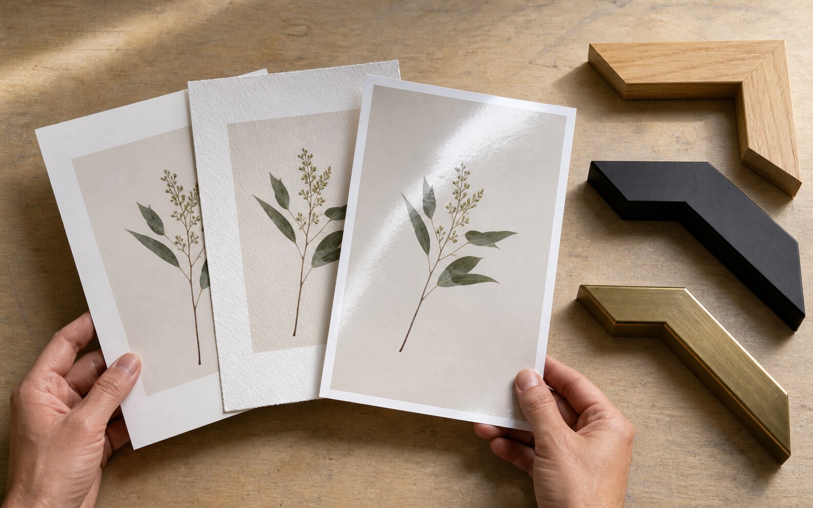
Look at the artwork's dominant qualities. A delicate diagram or typography-heavy print benefits from crisp detail. A soft botanical or painterly image may work beautifully on a paper with subtle texture. Dark, high-contrast images can show reflections more readily behind glossy surfaces.
Paper options in plain language
| Paper direction | Useful for | Consider |
|---|---|---|
| Matte presentation paper | Everyday wall art and reduced glare | Check weight and opacity before framing |
| Heavy smooth paper | Fine lines, text, diagrams, and graphic art | Make sure the printer supports the thickness |
| Lightly textured art paper | Botanicals, landscapes, and softer historical images | Texture can soften very small details |
| Photo-style paper | Saturated color and smooth image reproduction | Gloss can create reflections in bright rooms |
Choose the frame
Black frames create a clear edge and work well with graphic or high-contrast art. Natural wood can warm scientific, botanical, and neutral images. White frames reduce visual weight on a light wall. These are directions, not rules: repeat a material already present in the room when you want the frame to feel integrated.
When to use a mat
- To create breathing room around a detailed image.
- To fit a smaller standard-ratio print into a larger frame.
- To keep the artwork from feeling cramped behind a heavy frame.
- To introduce a quiet neutral border without editing the digital file.
Measure the mat opening, not only its outer dimensions. The opening should correspond to the visible print area and may overlap the paper slightly.
Room light and protection
Direct sunlight can affect paper and printed color over time. Place valued prints away from strong direct sun when practical. Glazing protects the surface from handling and dust, but reflective glazing can be distracting opposite a window. Ask a framer about available glazing when glare or long-term display is a priority.
Simple combination recipes
- Graphic chart: smooth heavy paper, narrow black frame, optional white mat.
- Botanical study: matte or lightly textured paper, natural wood frame, warm white mat.
- Colorful poster: smooth matte paper, simple frame that repeats one room material.
- Small desk print: sturdy paper and a compact ready-made frame with no mat.
Always match the downloaded file's aspect ratio to the print and mat opening before ordering the frame.
Use the artwork itself to pressure-test the choice. The open ground and delicate marks in an Aert Schouman bird digital download can suit a quiet matte surface and natural frame, while the sharper geometry and richer color of a 1920s fashion plate digital download may benefit from smooth paper and a crisp frame edge. These are starting points, not fixed rules.