Wholesale & Trade / August 18, 2026
How to Build a Wall Art Assortment for a Small Retail Store
By Rock Paper Scissors
A practical assortment-planning guide for independent retailers: choose a customer, balance proven themes with discovery pieces, merchandise a small footprint, and reorder with evidence.
Shop Rock Paper Scissors on Faire
Article guide
The short answer: a strong small-store wall art assortment is narrow enough to look intentional and varied enough to produce discovery. Start with one customer and one display zone, choose a few dependable themes, add a smaller group of surprising pieces, and place your first order so you can learn from sell-through before expanding.
You do not need hundreds of designs on the floor. You need a legible point of view, useful price and size choices, and a reorder process that tells you what customers actually want.
1. Define the customer before choosing the art
Write one sentence describing the person most likely to buy from this display. A museum store may prioritize collection-adjacent subjects and educational gifts. A design shop may lead with color, typography, and strong graphic shapes. A garden store may build around botanicals, birds, and natural-history subjects. A neighborhood gift shop may mix local feeling, humor, and broadly giftable art.
The sentence is a buying filter. If a design is attractive but does not support that customer or the store's point of view, it can wait for a later test.
2. Use a simple assortment mix
A useful starting model is a three-part mix. Treat the percentages as a planning tool, not a rigid formula:
| Share | Role | What belongs here |
|---|---|---|
| About 60% | Core | Subjects and palettes that closely match your known customer and store identity |
| About 30% | Discovery | Fresh artists, adjacent subjects, unusual color, or a new visual direction |
| About 10% | Conversation | Unexpected pieces that create stopping power and make the display memorable |
If your first order is small, translate the mix into individual designs rather than forcing exact percentages. The important idea is to protect the core while leaving room to learn.
3. Build small groups, not random singles
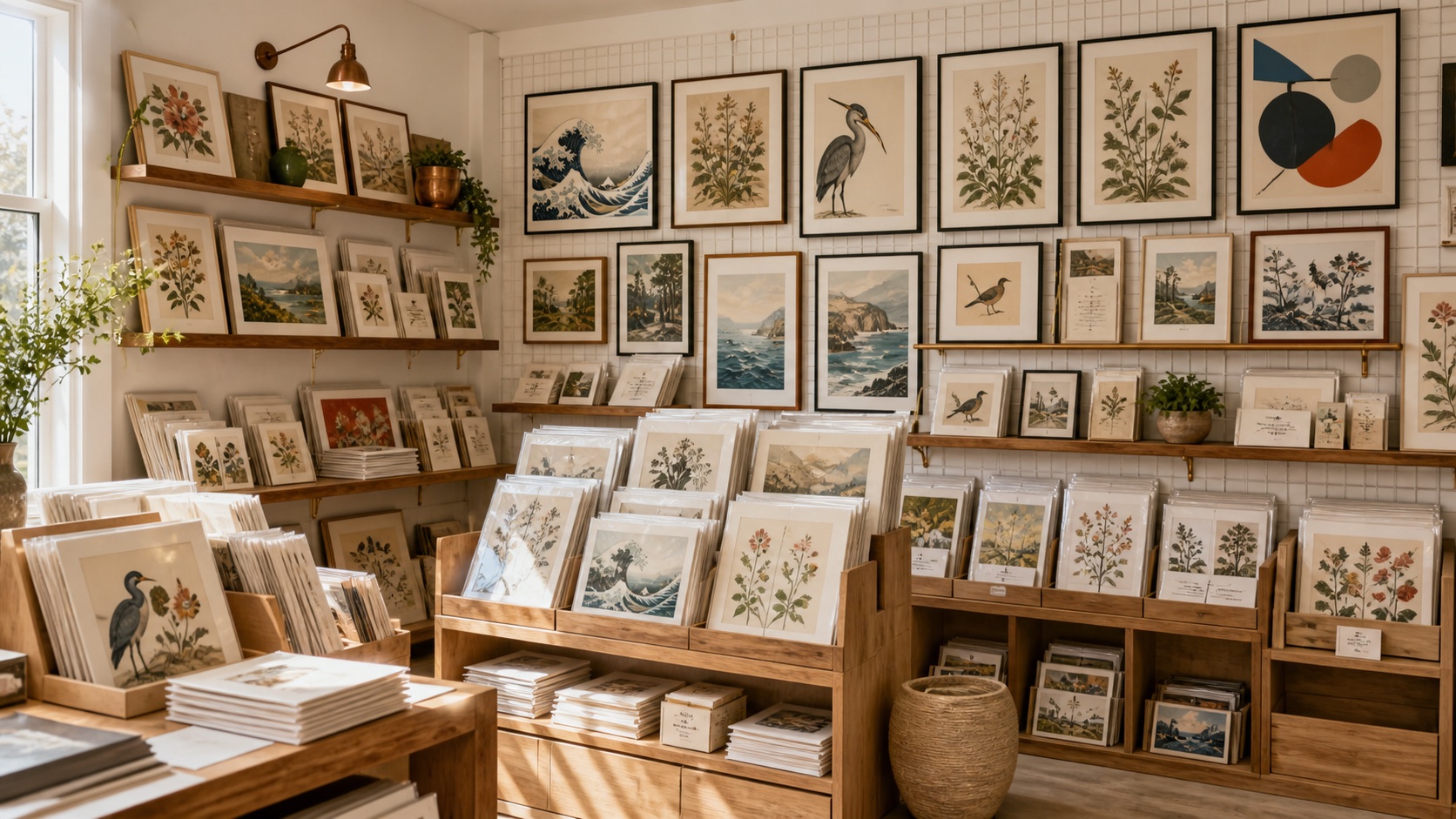
Customers understand a display faster when nearby pieces share a relationship. Group by subject, palette, artist, period, or visual mood. A botanical group can mix several artists while holding a green-and-neutral palette. A graphic-design group can combine color charts, diagrams, and typography. A museum-store group can connect to a current exhibition or a durable collection theme.
Within each group, choose one visual anchor and several easier supporting pieces. The anchor earns attention; the supporting pieces give customers more ways to say yes.
4. Plan the display before ordering
Measure the real fixture, wall, shelf, or print bin before you select quantity. Record usable width, height, shelf depth, and the number of forward-facing positions. Then decide how much back stock the store can hold without turning inventory into clutter.
- Gallery wall: use fewer designs with clear spacing and one or two anchors.
- Print bin: use dividers and visible labels so customers can browse without damaging the work.
- Tabletop fixture: keep the story tight and change the front-facing piece regularly.
- Mixed display: show a framed example above the packaged prints so the customer can imagine the finished result.
5. Choose the ordering path that fits your workflow
Rock Paper Scissors supports two wholesale paths. Approved buyers can order directly through our trade portal, where their account pricing and ordering terms are available after sign-in. Retailers who prefer their existing marketplace workflow can also order through Faire.
Use the wholesale overview to compare the paths. If direct wholesale fits your business, submit the trade access application. Current case quantities, prices, availability, and terms are shown in the applicable ordering channel rather than assumed in this guide.
6. Learn from the first order
For each design, record the date it went on display, its position, units sold, and whether staff heard a recurring comment. A piece that did not sell from a low or hidden position has not received the same test as a piece shown at eye level. Rotate fairly before deciding that a subject has failed.
Reorder the designs that sell while the display still looks coherent. Expand a winning theme by adding close companions, not by replacing the whole assortment. Retire slow designs gradually and keep one small testing zone for the next discovery group.
First assortment checklist
- One-sentence target customer
- Measured display and storage capacity
- Core, discovery, and conversation roles assigned
- Small visual groups with anchors and supporting pieces
- Chosen direct or Faire ordering path
- Simple sell-through and placement tracking
- A planned date to review and reorder
A compact assortment should feel edited, not limited. Start with a point of view you can explain, give each design a fair display test, and let actual customer behavior guide the next order.